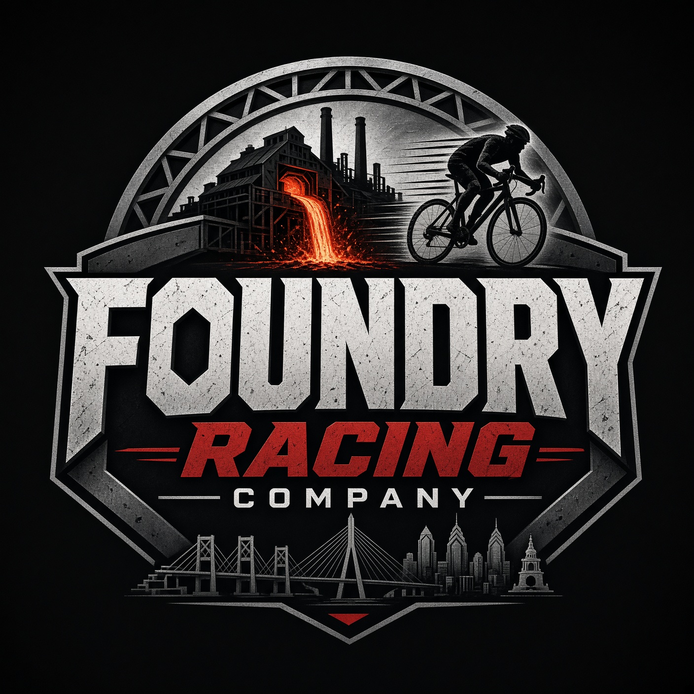
Who We Are
A Pennsylvania-forged cycling promotion company and elite masters racing team. Founded in 2026 by a group of Pennsylvania masters racers.
We are explicitly not a charity that rides — we are racers who give back. That distinction is central to the identity.
The Mission
Foundry Racing Company exists at the intersection of competitive masters cycling, historic preservation, and community. We ride the roads. We tell the stories. We fund the future.
We organize and promote road races, criteriums, and time trials across Pennsylvania — safe, well-run, fiercely competitive.
A roster of competitive masters riders who race hard and represent the state with pride.
Through charity century rides, we direct thousands of dollars to the battlefields, forests, and industrial sites that make Pennsylvania what it is.
Color Palette
Foundry Industrial Minimal — deep charcoal, bold red, raw textures.
Typography
Three typefaces. High contrast. No exceptions.
Voice & Usage Rules
How the brand speaks and how it should be applied.
Pennsylvania-Centric
Every reference is PA, never generic. Historic sites named specifically — Valley Forge, Michaux, Bethlehem blast furnaces, Gettysburg.
No City Shorthand
The brand is statewide. Use "Pennsylvania" throughout — never city-only shorthand.
Foundry Metaphor
Manufacturing language throughout: forge, mill, anvil, hammer, foundry, molten, steel, backbone, forged. Sponsor tiers follow the same metaphor.
Hard, Raw Voice
Short declarative sentences. No soft language, no hedging. Uppercase headings, tight letter-spacing, mono-font accents.
Real Copy Only
Every section has specific, business-relevant copy. No lorem ipsum, no placeholders.
Square Corners
Radius 0.25rem. Nothing soft or rounded. Hairline borders (#1a1a1a, #333). Grain texture on key sections.